Translating Picture Book Covers and Illustrations: How AI Image Translation Works
Ask a picture book author what worries them most about translation and it is almost never the story text. It is the artwork. The cover their illustrator spent three weeks on. The hand-painted title. The little sign above the bakery on page seven. The speech bubble that fits the fox's mouth exactly.
The worry makes sense. Your book is half pictures, and the pictures have words in them. A translation that changes the story text but leaves "The Little Fox" painted across the cover in English is not a Spanish edition; it is an English book with Spanish insides. And until recently the only ways to fix that were expensive: go back to your illustrator with the layered source files, or pay a designer per image, per language.
This post is about what happens to your artwork when LingoHop translates a picture book, shown mostly in before and after images, because that is the only evidence that counts. It is also about the part of the process that makes the biggest difference to how those images come out, which is not the AI at all. It is you, in the review step, before a single image is generated.
If you have not seen the full pipeline yet, the step-by-step walkthrough of how translating a children's book works covers the whole journey from upload to export. This post zooms in on the illustration step.
What actually happens to your artwork
The principle is simple: the AI edits your existing illustration, it does not draw a new one.
For every illustration in your book that contains text, the model receives your original artwork and the reviewed translation of the words on it. It repaints the text areas in the target language and leaves the rest of the image untouched. The composition stays. The characters stay. The colours, the brush texture, the way the title curves over the hill: all of it stays. What changes is the words.
You never have to take that on trust, because every translated image has an Original / AI translated toggle on the review screen before you export anything. Flipping between the two swaps the version in place, in the same frame, so what changed and what did not is immediately obvious. If a particular image did not come back the way you wanted, you can regenerate it or keep the original. Nothing ships without you seeing it.
That is the whole mechanism, as much of it as a reader of this post needs. The more useful question is: how well does it work, and where does it not?
The cases that sound hard but usually are not
Authors tend to assume the difficulty ranking runs from plain text (easy) to hand-lettered art (impossible). The real ranking is different, and mostly better news.
Clean cover titles are the easy case, as you would expect. A title set on a coloured background comes back in the same style, same weight, same placement, in the new language.
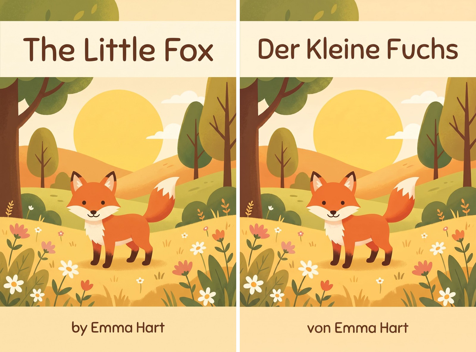
The easy case: a clean cover title. Same artwork, same style, new language.
Signs, banners, and labels inside the illustrations also translate reliably. The bakery sign, the "Welcome" banner across the school gate, the name tag on the dog's collar. These are exactly the details that make a translated edition feel native rather than imported, because a child reading the German edition sees a world that speaks German.
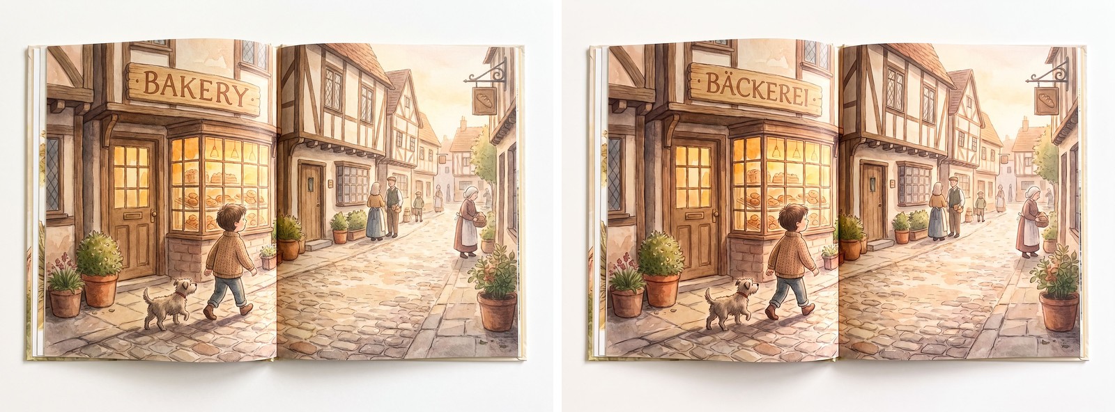
Illustration text is real text. The reader sees it, so it has to speak their language.
Speech bubbles work well too, including the resizing problem that comes with them: translated text is very often longer than the English original, and the model reflows it inside the bubble.
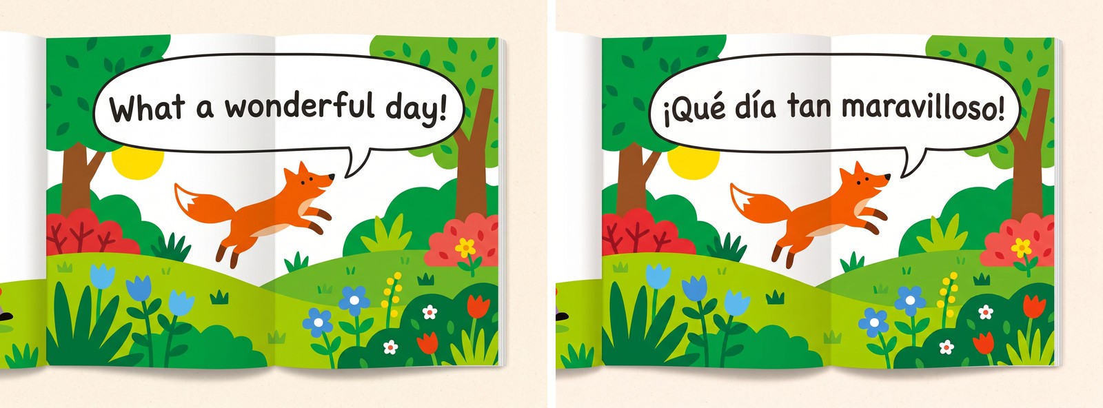
Spanish and German run longer than English. The text reflows inside the shape the illustrator drew.
Hand-lettered titles and decorative fonts are the surprise. This is the case authors assume will fail, and it is the one where the results most consistently beat expectations. Painterly lettering, ornate serifs, storybook script: the model matches the style of the original closely enough that, on most covers, a reader who never saw the English edition would not suspect the lettering was not drawn that way.
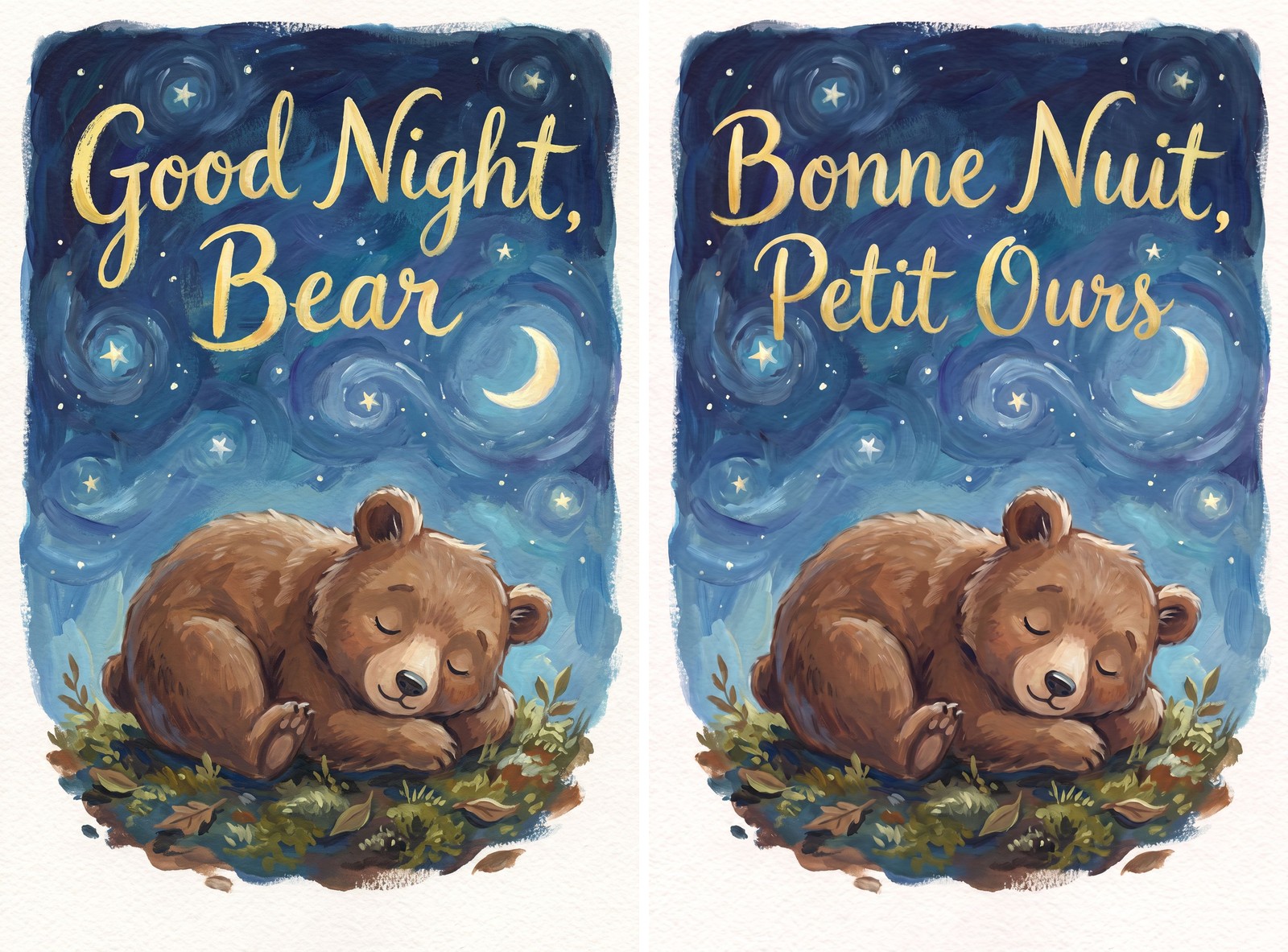
The case everyone expects to fail. Hand-lettered titles usually come back matching the original style closely.
None of this means every image is perfect on the first pass. It means the failure you are probably imagining (your artwork coming back as something else) is not how this fails. When an image does need another look, it is usually a detail: a slightly different letter weight, a line break in an odd place. That is what the regenerate button and the per-image review are for.
The case that is actually hard: when the word is the artwork
There is one situation where AI image translation runs into a wall, and it is worth understanding because it is a design problem, not a technology problem.
Sometimes the word and the picture are the same thing. The title of the book is "Forest", and the illustrator drew the letters as trees, trunks for stems and canopies for the round shapes. A character's name is painted so the letters form the shape of the thing it names. A visual pun lives inside the lettering itself.
Translate that title and the word changes. "Wald" has four letters where "Forest" has six. The tree-shaped F and the tree-shaped T do not map onto a W and a D. Even a technically flawless edit now has a choice to make: preserve the visual idea and lose the exact design, or preserve the layout and lose the reason the design existed. No translator, human or AI, can make that choice for you, because it is an art direction decision about your book.
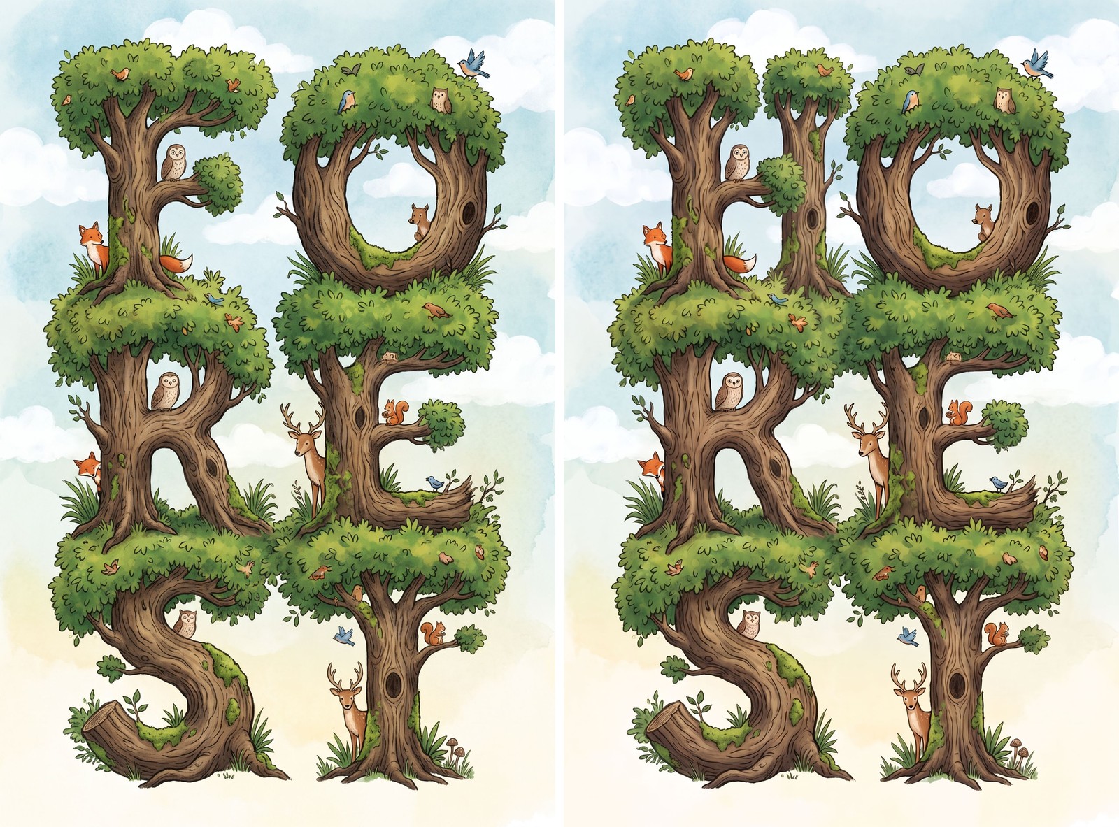
The hard case, from our own test run. Asked for German, the model kept the six tree-letters and produced something that is not a word at all. When the letters are the picture, a new word means a new design decision, and that decision is yours.
In practice, authors handle this one of three ways. Some accept the AI version, which keeps the spirit of the design even if the letterforms differ. Some keep the original English title art and translate everything else, which works better than it sounds for titles that are short and iconic. And some take that single image to a designer with the layered source files, which is now a EUR 50 to EUR 200 job for one image instead of a per-book localisation contract. The point of the review screen is that you see the case clearly and choose, rather than discovering it in a printed proof.
The same logic applies to puns and wordplay painted into the artwork. If the joke depends on an English word that appears in the picture, the translated joke may need a different image, or a different joke. Which brings us to the part of the process that actually decides how good your translated artwork is.
The biggest quality lever is your review, not the AI
Here is the thing this post most wants you to take away. The image model renders whatever the reviewed text says. It does not decide what your cover should say in German; it paints what the translation says, as well as it can. So the quality of your translated artwork is set one step earlier, in the text review, before any image is generated.
This is where a translated picture book is won or lost, and it is why the LingoHop pipeline puts a full review screen between the text translation and the export. A few examples of what that review is for:
Evening out a joke. Humour is the most fragile cargo in any translation. A pun that sings in English can land flat in German, and if that pun is painted on a banner in the artwork, the flat version is what gets painted. In review, you (or a native-speaking friend) can swap the joke for one that works in the target language, and the artwork gets the good version.
Pinning down a term. Maybe the wizard's shop is called "The Whistling Kettle" and you want the French edition to use a specific name, not whatever the engine picks. Maybe your character has a catchphrase that must be worded the same on every page it appears. Review is where you make that decision once, so it shows up consistently in the text and in the artwork.
Tuning the tone. The difference between a warm bedtime voice and a dry, cheeky narrator often comes down to small word choices, and some of those words sit inside the illustrations. Style notes steer the whole book, and the per-page review lets you nudge individual lines until they sound like you.
Solving the space problem before it exists. German runs long. If a line is going to burst a speech bubble, the cleanest fix is a shorter phrasing chosen in review, not a font shrunk to fit at render time.
The order of operations matters: review the text, then generate the images. Fix the words while they are still words, and the corrected version is what gets painted into your artwork the first time. If you have read our post on whether AI translation is good enough for a children's book, this is the same principle extended to the artwork: the AI produces the strong draft, and a short human review turns it into the published version.
What this looks like on the review screen
For every illustration with text, the review screen shows the image at the size it will appear in the exported book, with a small Original / AI translated toggle above it. Clicking between the two swaps the version without moving the image, which is the fastest way to catch small differences: a shifted baseline, a lettering weight that came back slightly heavier, a colour that drifted. Things that are easy to miss when two versions sit apart from each other jump out when they flip in place.
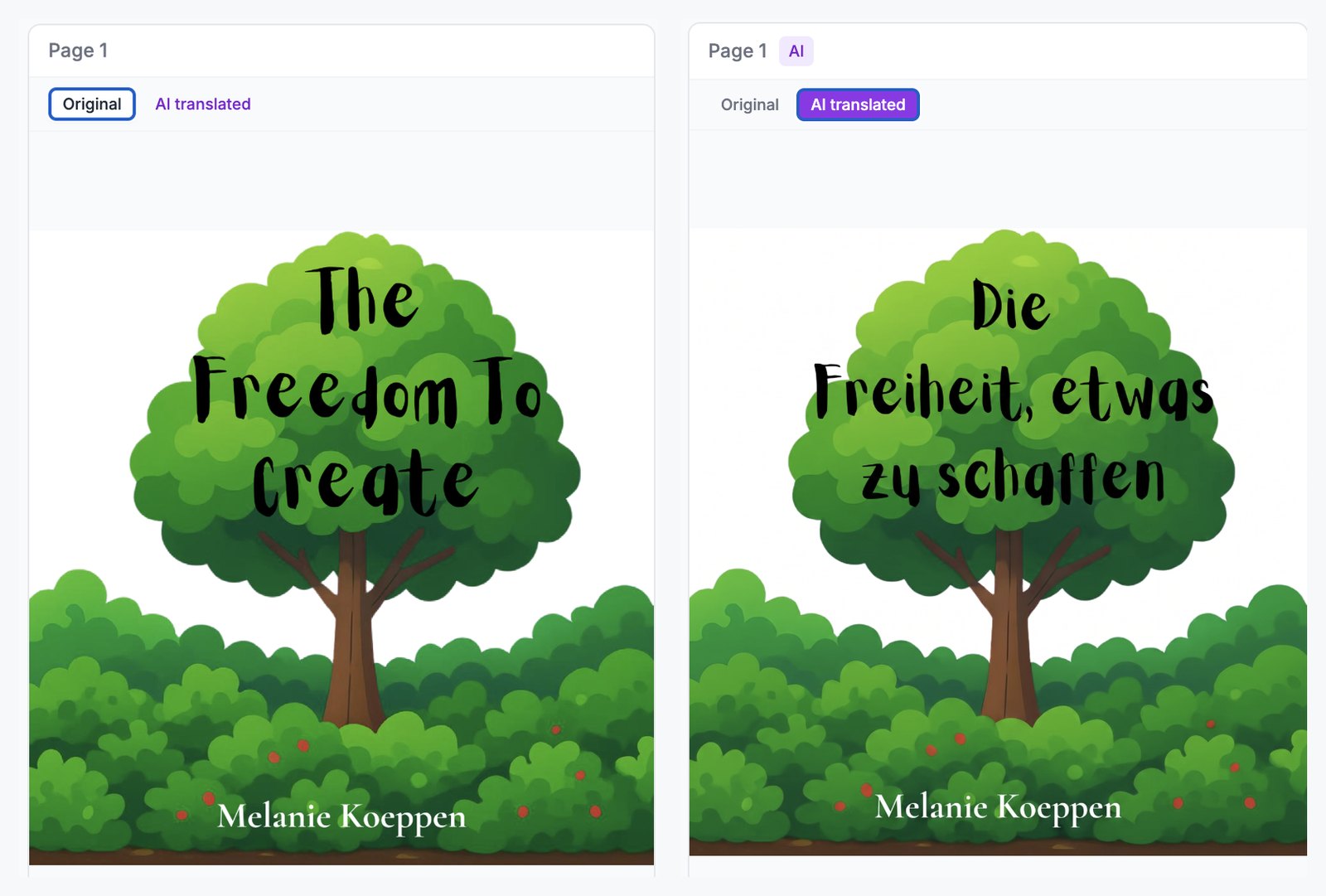
The same card, one click apart. The toggle swaps the version in place, so the only thing that moves between these two views is the words.
Each image has its own controls: regenerate if the result is off, keep the original if you prefer it, and a per-page instruction box if you want to steer a specific image ("keep the lettering colour warm yellow, like the original").
The per-image choice matters more than it looks. A finished translated edition does not have to be all or nothing: a common export is a book where every meaningful image is translated and one or two decorative spreads, where the text is atmospheric scribble rather than readable words, are deliberately kept as drawn.
The honest limits, in one place
So that expectations are set before you upload:
The AI edits artwork; it does not redesign it. Word-as-artwork titles and visual puns need a decision from you, and occasionally a designer.
Lettering style is matched closely, not cloned. On most covers the difference is invisible; on a cover where the exact letterforms are the identity of the book, review the result critically and keep the original if it does not convince you.
Right-to-left languages (Arabic, Hebrew, Urdu, Farsi) are not supported yet, for the artwork or the text, because those editions also need the page order reversed.
See it on your own cover
Everything in this post is easier to judge on your own book than on ours. New LingoHop accounts include two free sample translations: upload your picture book, pick a language, and in about half an hour you will see your own cover and a couple of interior spreads translated, with the originals one click away. If the artwork convinces you, translate the whole book for EUR 59 (EUR 79 for very large picture books; the cost guide has the full breakdown). If it does not, you have spent nothing and you know exactly where your book stands.
Your illustrator's work survives the translation. That is the whole promise, and you get to verify it before you pay.
Melanie
Frequently asked questions
Will AI redraw or regenerate my illustrations when translating my picture book?
No. The AI image model edits the existing artwork rather than drawing a new picture. It replaces the visible text with the translated text and keeps the rest of the illustration intact: the composition, the characters, the colours, the texture. On the review screen every translated image has an Original / AI translated toggle, so you can flip between the two versions in place, and you can keep the original for any page where you prefer it.
Can AI translate a hand-lettered or decorative title on a book cover?
Usually yes, and better than most authors expect. Hand-lettered titles, decorative serif fonts, and painterly text tend to come back matching the style of the original surprisingly closely. The result is always shown next to the original before export, so you judge it yourself rather than taking it on faith.
What is the hardest case for AI image translation in a children's book?
When the word itself is the artwork. If your title is the word Forest and the letters are drawn as trees, translating it changes the word, and the new word may not carry the same visual idea, or may simply be a different length and shape. The same applies to visual puns painted into the illustration. These cases need a design decision from you: keep the original, accept the AI version, or have a designer rework that one image.
Why should I review the text translation before the images are generated?
Because the image model renders whatever the reviewed text says. If a joke lands flat in German, if a character catchphrase needs a specific wording, or if a sign should use a particular term, fixing it in the text review means the corrected version is what gets painted into the artwork. Fixing text after image generation means regenerating those images. Review first and the images come out right the first time.
What happens when the translated text is longer than the English original?
Translated text is often longer, German famously so. The image model resizes and reflows the text within the space the original design gives it, which works for most covers, signs, and speech bubbles. When the space is genuinely too tight, the better fix is usually in the text review: choose a shorter phrasing for that line before the image is generated.
Can I keep the original artwork for specific pages?
Yes, per image. Image translation is generated one illustration at a time, and any page you do not generate keeps its original artwork in the export. The cover additionally has its own Keep original cover switch. So a book where 28 images are translated and 2 are kept as drawn is a normal export, which is a common choice for decorative spreads where the text is atmospheric rather than meaningful.